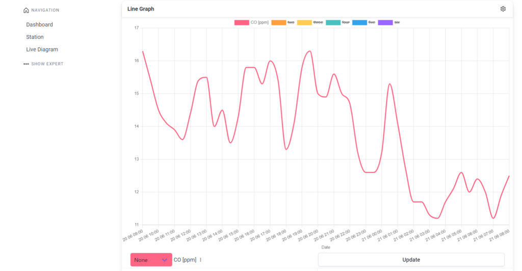
The chart is a standard line graph. The horizontal axis represents time, while the vertical axis represents the measurement unit. Using the settings wheel in the top right corner, you can configure the axes. You can assign individual parameters to the axis on which they should be displayed. The separate axes are there to prevent the graph from becoming unclear when the measurement values from the unit are far apart. There is an update button that should be pressed after making changes. There is also a button for automatic updates (Automatic Redraw). The lines are color-coded, with a legend displayed vertically at the top.